
My Role:
Team Lead
UI/UX designer
5 weeks
Sept to early Oct 2023
User Research
Iteration of Onboarding Screens
User Research Notes
Personas
User Journey Maps
Iteration of Onboarding Screens
Through an intensive 5-week internship with Impact Immersive, I applied my design knowledge to a real-world project. During this project, I worked with the client of Impact Immersive LLC alongside two other Springboard designers.
Team Lead responsibilities: coordinate availability and communications with the client, send meeting agenda to client prior to our meetings
Impact Immersive is an innovative augmented-reality (AR) studio located in Los Angeles. Impact Immersive focuses on creating immersive environments for organizations so that people are better able to visualize concepts and ideas due to more interactive experiences with the environment.
The team and I acquainted ourselves with the product: Flowrish. Flowrish is an augmented reality (AR) mobile app that gives users the ability to visualize CA native plants in their garden.
The two main objectives of Flowrish:
Introduction Week
Kickoff Meeting
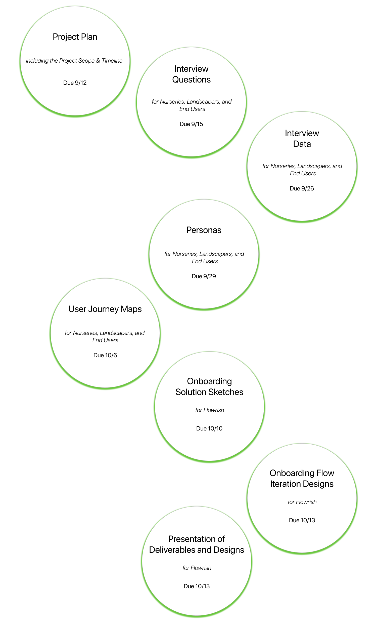
Project Plan
User Research &
Conducting Interviews
Synthesize Data
Finish Up Interviews
Personas
User Journey Maps
Iteration of Onboarding Screens
It was essential to connect with my Springboard collaborators and the client before our kickoff meeting on the project together. Knowing my teammates’ time zones will help gauge possible times to set up our weekly meetings with the client, and to start developing our expectations for collaboration and communication.
As team lead, my responsibilities were to
In our initial email to the client, we decided on the date and time for our kickoff meeting, the agenda for our meeting, and a quick introduction of each UI/UX designer.
I set up our kickoff meeting document with questions to ask the client so my Springboard collaborators and I could better understand the company, and the client's expectations of the final deliverables during this time together.
Questions asked were focused on understanding the scope of the project and final deliverables expected:
User research, personas and journey maps for each user group identified, iteration on the onboarding screens
We were added to a Discord group, where we gave her updates and asked for feedback on our work.
We met twice a week, and the days we met would change each week (Mondays and Thursdays, or Tuesdays and Fridays).

Many home and business landscapes in California are currently dominated by non-native plant species and the idea of transforming these spaces with native plants to promote water conservation seems daunting.
To address this issue and encourage greater participation in the Turf Removal Program, water companies should take proactive steps to:
These measures aim to reduce customer hesitancy and helps promote more water-efficient landscaping practices in California.
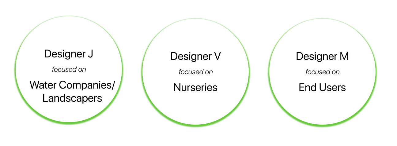
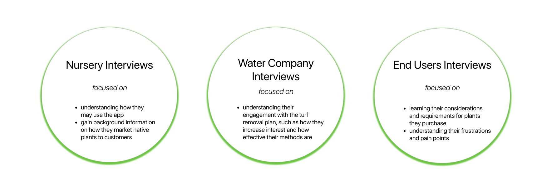
Interviews were conducted during this time and for each of the user groups, the focus of the interview varied. My focus group during user research focused on end users.
End Users
Understand user’s perspective and understanding on the topic of water conservation and turf removal
The UI/UX team developed potential questions to ask for each user group, and sent the questions to the client for review. My questions in particular focused on the end users and their experience with gardening.
In addition to these basic questions, it’s important to also think about:
I included more questions geared towards understanding the difficulties and pain points users encounter when gardening:
There were three steps to synthesize data gathered using affinity mapping:
One difficulty I ran into while conducting user research was that it was hard to determine the number of people who would be at the plant section at Home Depot. Three different Home Depots were visited, but I was only able to interview two people; one where I was unable to conduct a full interview because she was in a rush to get back to work.
In the CA Native Facebook group, promotions were not allowed so I reached out to people who posted on the page about their native gardens to see if they would be open to chatting with me about their experience with gardening. It was unclear to determine who would be responsive and open to chatting with me about their experiences.
After synthesizing the data from user research through affinity mapping on FigJam, these were common themes that came up:
The team and I spent more time on user research due to not having enough data to create another end user persona. We worked together to reach out to those that work with this end user, which were landscapers.
Those interviewed liked to work on converting their yard into a native garden on their own, which led to a DIY gardener persona being created using the data gathered from user interviews. After sharing the DIY gardener persona with the client, she requested for another persona to be created: someone who hires a landscaper to do the work and is hands off with the project. There was not enough data gathered for the second user, so we spent two more days gathering data.
While looking for users who hire landscapers, the UI/UX team decided to reach out to landscapers since they are the direct people who work on converting lawns to native gardens. We specifically looked for landscapers experienced with native plants, and reached out to see if they were open to talking with us. With the data gathered from these native plant professionals, we developed a second end user persona who hires a landscaper.

Using data from user research, we created user journey maps for each of the user groups: landscapers, nurseries, and end users. The template I found was adjusted according to what the client wanted. She wanted clear steps the user group engages in from the start to finish of converting a yard to a native plant garden. For each step, we determined the user’s touchpoint with the Flowrish app along with the user’s frustrations and pain points, and opportunities for Flowrish to mitigate those frustrations.
When reviewing the steps with the client, she felt that there would be more steps involved with the conversion of a yard to a native garden which led to a version 2 of the user journey steps.
The steps fell under two categories: turf removal, and planting natives. Information under steps 1 to 3 were based off of data gathered from landscapers and ideas from what we know about the users who hire landscapers. Information for steps 4 and after that related to planting were based off of the data I gathered from user interviews.

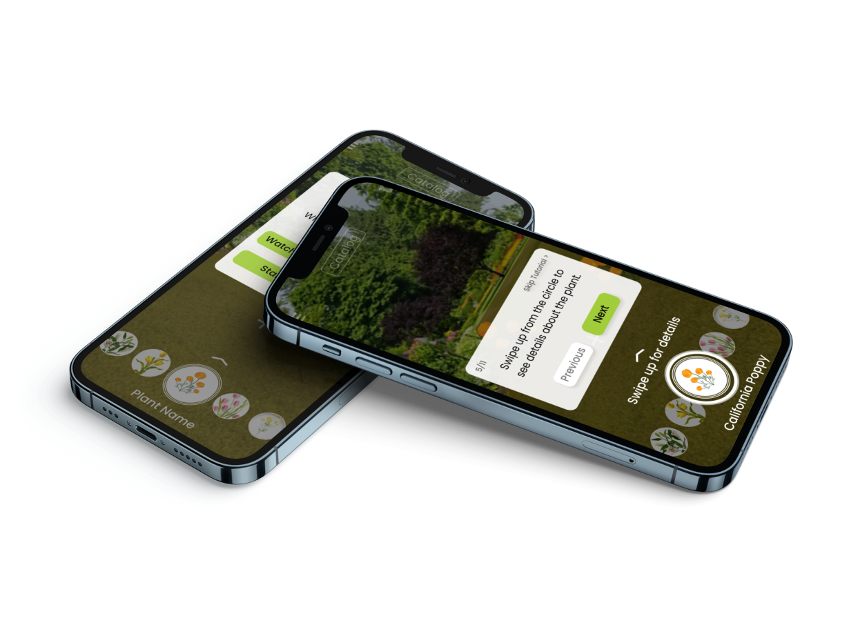
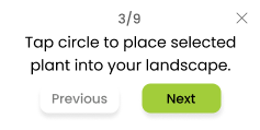
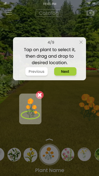
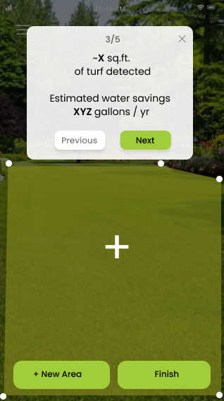
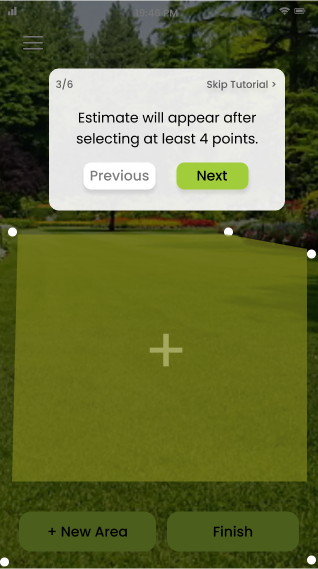
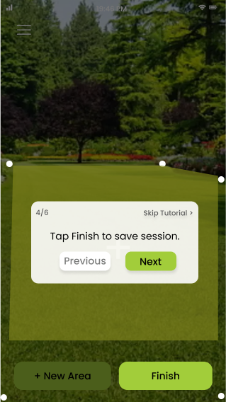
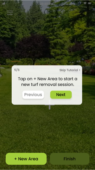
During the kickoff meeting, the client expressed her desire for the UI/UX team to iterate on the current onboarding designs. She wanted to move away from the cartoonish aspect of the current illustrations to a more clean and realistic approach.
The team agreed it would be helpful to have an overview that introduces the product and its functions before guiding the user through the onboarding screens. My suggestion for redesigning the onboarding screens was to use a spotlighting feature to teach users how to use the app while directing their attention to the different features and functions of Flowrish. This resolves the client’s request for cleaner designs for the onboarding flow.
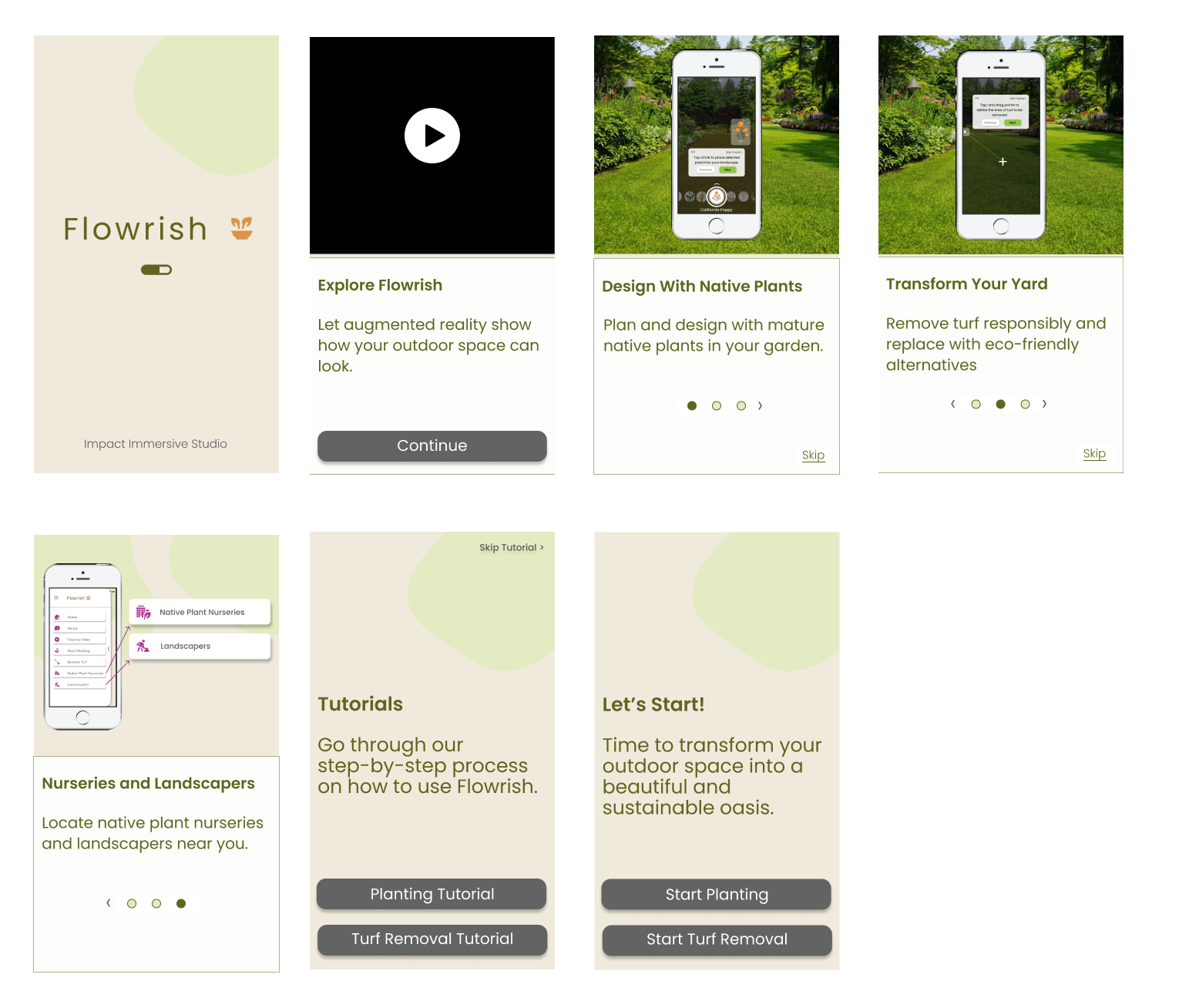
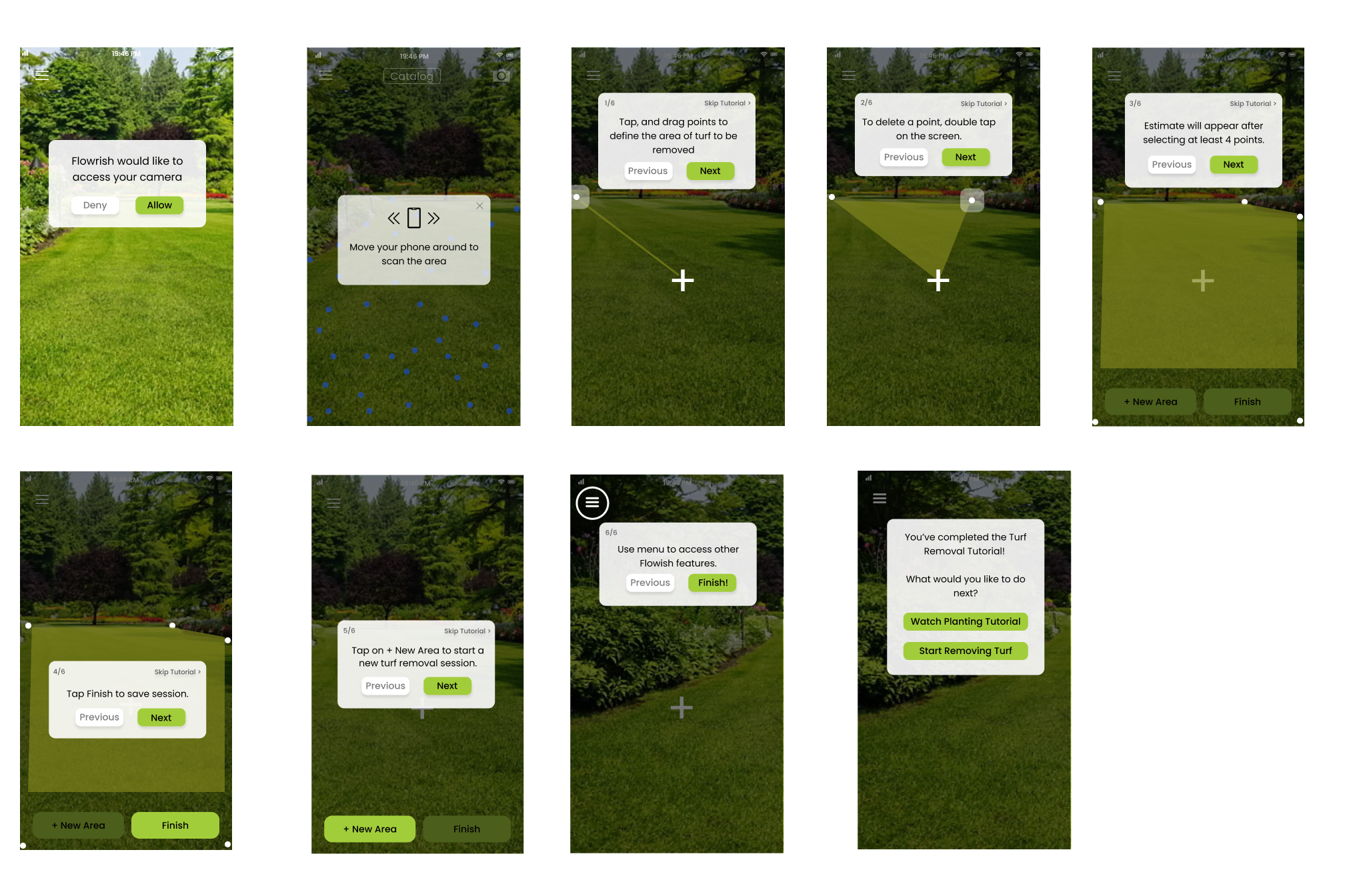
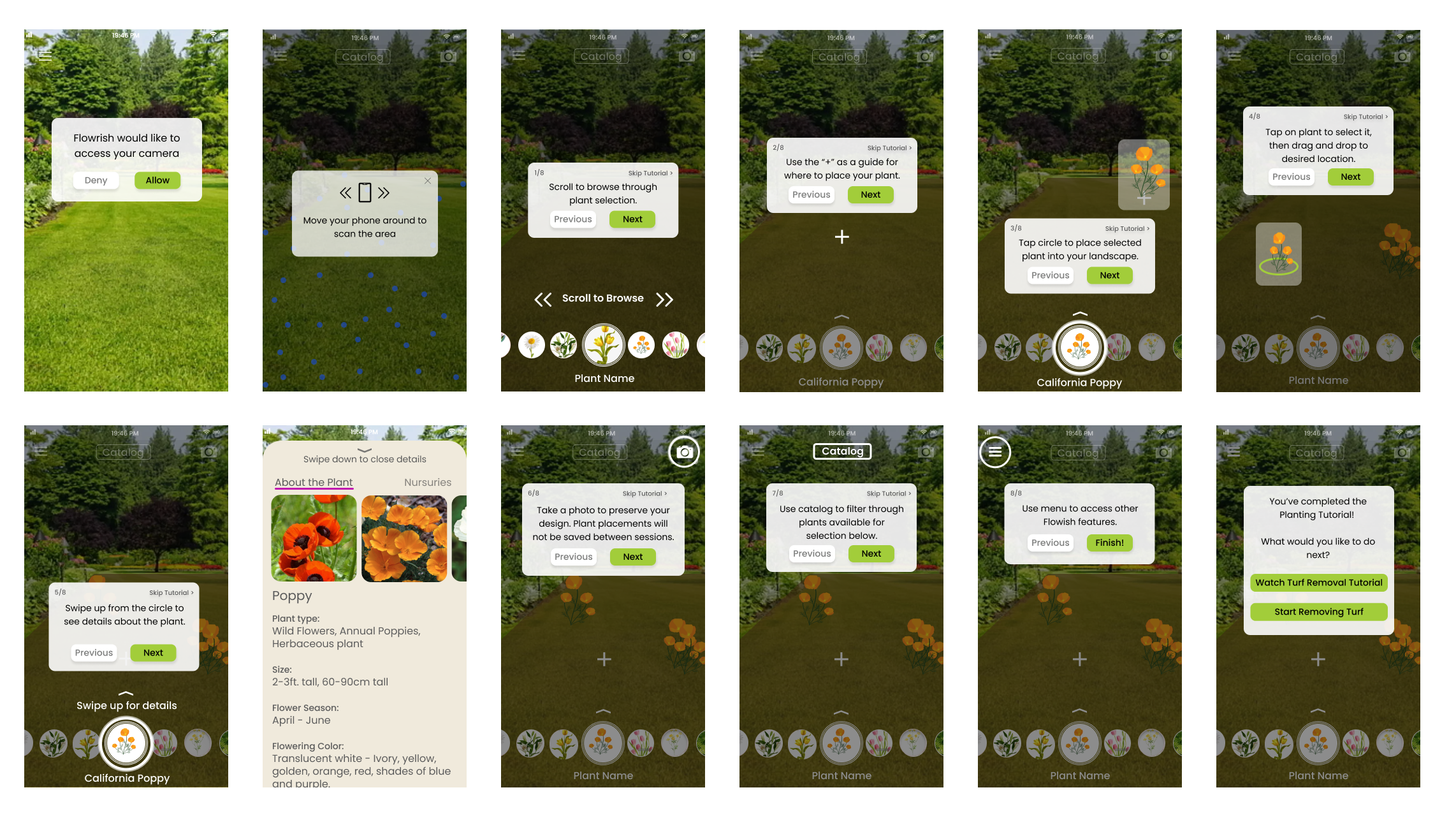
We used the directions that were given in the existing onboarding screens and included several additional screens that introduced more functions, such as the catalog function, how to find details of a plant, and the menu function.
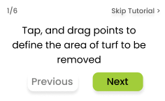
The progress information was on the upper right hand corner, with two CTA options: skip tutorial and next.
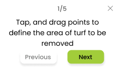
Designer V mentioned it is good practice to include an option to go back to the previous direction, so we included it next to the “next” CTA button and removed the “skip tutorial button” and added a “X” symbol so users can exit out of the directions box.
Designer V suggested removing the progress information entirely, but my reasoning for adding it to the design is because it’s important for users to know their progress in the tutorial, especially since we have a handful of steps and users might question if it would be quicker for them to skip the directions entirely, which is something that we wouldn’t want them to do.
We presented our design decisions for the onboarding screens during our last meeting together to receive feedback from the client so we could make changes before submitting our final deliverables to her.
One major change to the designs was to include the “skip tutorial” CTA button for users. The client says that with the “X” button, it’s not clear if this skips the tutorial or closes only the directions the users are currently at.
Another change that the client requested was for the red CTA button to be removed. She explained the idea was nice, but when there are multiple plants in a group, it would be difficult to choose a particular plant to be removed.
A challenge was working with the client’s feedback regarding one of the screens for the turf removal tutorial. The client wanted this information in two screens rather than one; she requested for the information to be on one screen and the directions for adding a new area to be on a different screen.
During the meeting I understood the changes the client was requesting, but I wasn’t sure how to implement it. The UI/UX team met up after the final meeting to brainstorm and implement design changes that the client requested.
These are the final screens after we implemented the feedback the client gave on the previous screen. We broke down the previous screen into more manageable steps for the user:
Challenge #1
Difficulty in User Research
We had difficulty getting into contact with someone from the water companies to ask for an interview due to their busy schedule. User interviews with end users was difficult because it was hard to discern how many people would be at Home Depot shopping for plants, since it is a factor that we cannot control.
Challenge #2
There was confusion amongst the team.
The client asked for onboarding changes and one of the designers was confused as to why the client wanted a duplicate flow of the onboarding screens. We clarified with the client on what exactly she wanted to be changed, and the client mentioned that the current screens with pop up directions aren’t part of the onboarding. These were pop up texts that appear when the app doesn’t detect movement or action from the user, and are intended to help the user.
We clarified that what she wanted were onboarding screens that were part of the tutorial in teaching users how to use the app.
While working in a team alongside a client I learned how to:
I was able to further improve on engaging with user research and gathering new perspectives for a project while practicing in keeping an open mind and not asking leading questions.
Practice with making sure our designs meet design requirements, such as giving users autonomy and choice, and showing them their progress within the app.
Understanding what is possible to deliver during the amount of time that we are given and conveying this to the client after experiencing delays within the project.
The team and I spent more time gathering data since we didn’t have enough data for a persona, and due to this change, the deliverables after user research got pushed back a few days. With this delay, the team and I realized that it would be difficult to complete both personas and user journey maps in addition to making design changes to the existing onboarding screens that the client requested for.
We spent a majority of our time with user research and not much time with design. We made the decision to ask for a one-week extension on the project and checked in with our client before requesting the extension from the Springboard IDP team.
If you like what you see and want to work together, get in touch!
mingshi0821@gmail.com